FTFa

In 2021, we launched a new website for the unemployment insurance fund FTFa and their 145.000 members. FTFa is an unemployment insurance fund for everyone, and they came to us because their website needed to meet some of the WCAG principles. But we did much more than that! Read about the collaboration and digital transformation right here.


To begin with, we had one, at most two, focus points: Making ftfa.dk WCAG compliant and possibly updating it to Umbraco 8. In the initial workshop, however, we discovered that we could address more of the client’s needs by upgrading the website further. Editorial freedom and meaningful presentation of content needed attention as well.

Wait a minute, what is “WCAG” and why is it important?

WCAG stands for Web Content Accessibility Guidelines. WCAG is a series of web standards that ensure that everyone can access the internet – whether you have limited sight, can’t operate a mouse or live with other disabilities, the WCAG principles make sure that you have a good, or at minimum decent, user experience online.

Currently, the WCAG principles only apply to public institutions, but from 2025 they apply to everyone else as well. If you have not yet planned how your company is handling this transition, we recommend that you do so soon.

For the collaboration with FTFa, we teamed up with Ballast, a company specialized in accessing WCAG. Their specialists conducted a thorough analysis of FTFa’s website, pointing to three areas that our UX experts should give attention:

  • Keyboard navigation
  • Contrast colours
  • Screen reading

Our UX and IU experts ensured that the new website meets the WCAG principles so that, like FTFa, it is for everyone. For example, we implemented user-friendly keyboard navigation where the chosen menu item is highlighted, we increased the contrast colours on the website and optimized the website for screen reading tools.

Editorial freedom and a user-friendly backend = efficiency!

The initial UX workshop brought to light the need for more editorial freedom. With hectic workdays, the difference between a frustrating digital solution and a user-friendly one makes a remarkable difference when it comes to time and efficiency. It is simply a business-critical investment.

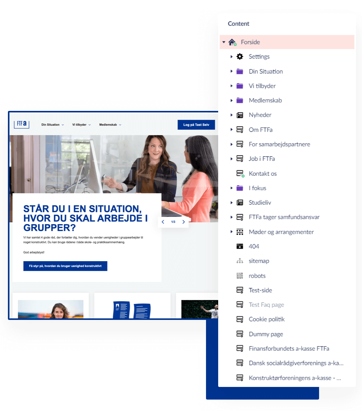
We tailored a user-friendly Umbraco backend where the editors at FTFa easily manage their various tasks. A new modular system focusing on simplicity and ease of use is, in addition to the implementation of FTFA’s visual identity, key elements in making the backend a great experience – and an efficient one. The tailor-made backend leads to less confusion, more productivity and happier editors.

Relevant content for each member

Presenting FTFa’s members with more relevant content is another area of focus on the new ftfa.dk.

When the member navigates the website, they are presented with carefully chosen content related to the content they are currently consuming. The promoted content isn’t necessarily what the user is actively looking for, but something that might help them in broader terms and includes events, webinars, and news. In this way, we ensure transparency and relevance everywhere on the site.

We presented the new solution to the client using clickable wireframes. This is the best possible way to convey the thoughts and strategies for the new website; literally showing the business-critical choices and navigating it, instead of just delivering a flat, non-clickable PDF. With the clickable prototype, the client was able to get a sense of the website structure and flow both on desktop and mobile.

Training in the new Umbraco backend is the best delivery

We taught key content editors at FTFa how the new Umbraco platform works, for example how the modular sections in the backend can be utilized, how to best navigate and more.

A vital part of delivering a new or upgraded website is, if you ask us, training in how to use the new solution. A new system can very easily cause fear and frustration, thereby hindering the intended efficiency and ease of use. By focusing on training, we make sure that the employees feel safe and well-instructed before launch.

Fantastic feedback from FTFa

(shortened and translated)

You have been very patient, dedicated, professional and super skilled all the way. This has made working with all of you a pleasure – from framework, choosing version and platform, data baseline, developing wireframes and design to project management, training, helpdesk stuff and deployments. And I could go on.

As a client, it is important to feel truly heard and taken seriously, while getting the much-needed help when it comes to knowledge or competencies that you do not have in-house. You are great at this!

I am looking forward to our continued collaboration.

Kristine Vestergård Christoffersen
Digital Communications Consultant